Well I just have to share this with you guys. We all know that when it’s set up correctly, the Vertex can produce amazing prints. But even I was staggered by today’s print. At nine and half hours for the base, plus a further five hours for the lid and insert, it is by far my longest print job.
It’s also one of the roughest on the machine. The fine exterior detailing causes your machine to sound like it will rattle itself to bits and it has to go on for hours like that. I could barely believe the machine was still in one piece by the end of it.
But my God, what an incredible print! The photos had to be with inside lights and with the crappy HDR on my phone, they really don’t do it justice. The exterior has a gorgeous satin like look and feel to it. The whole thing printed without a single error, blob, over extrusion or oozing of any sort - over nine hours!
I think this really shows the capabilities and potential of the technology. Everyone who picks it just goes "Wow! "
I’m frankly gobsmacked by the quality of this print. To print for so long, on a print with that much detail it sounds like your printer is going to explode into a thousand pieces at any moment, to print all that without a single blob or error anywhere seems almost miraculous to me! As I say, the strong downward lighting makes it look cruder than it is. Every tiny detail is perfect.
I don’t think so, I suspect that’s printed flat with the other colour for the first few layers and then finished with the gold colour. It’s too intricate to cut.
I wasn’t thinking of cutting it with an actual tool but with a software like netfabb.[/quote]I think the fine detail would break if you tried to get it off the bed. e.g. the grapes
BTW for anyone else attempting this print, I think the insert letter would be better printed on its edge. The resolution is much better. This one was printed flat and you can see the detail is not quite as good as the letters on the side of the box. Of course it might topple over, but so far my thin, vertical prints have been OK up to 3 cm, I assume this one would be OK (it’s about 5 or 6cm).
You’re right. It can perhaps be done printing it with 2 heads (one for the background and one for the letter).
[quote=“biscuitlad”]Of course it might topple over, but so far my thin, vertical prints have been OK up to 3 cm, I assume this one would be OK (it’s about 5 or 6cm).[/quote]With a brim it should hold in place… or not. It might be necessary to add an abutment on the back to prevent it from wobbling.
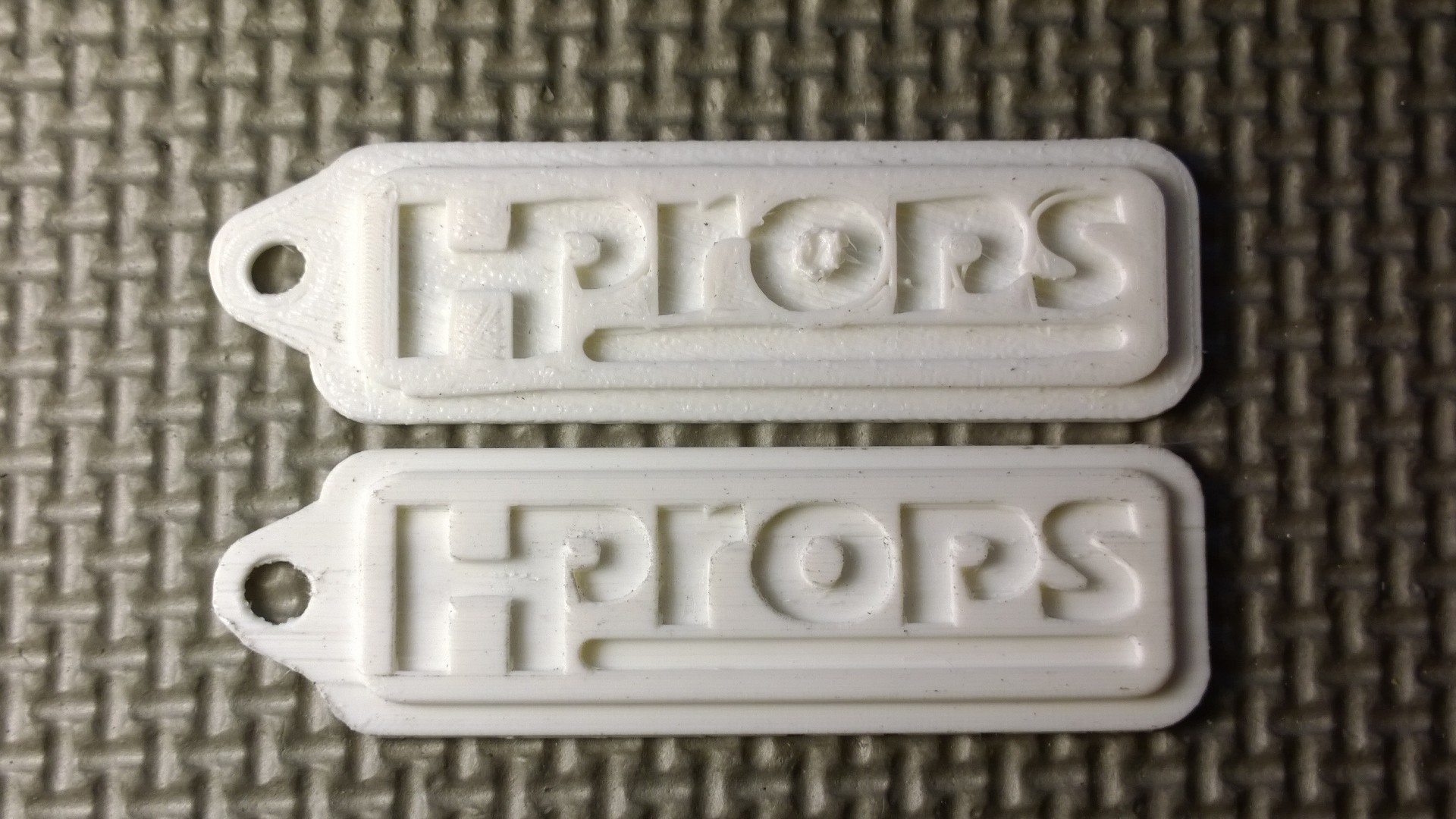
Beautiful work! Clearly a kindred soul: SLA dreams and an FFF budget! Are you printing at 50 microns? I’m having sporadic success so far, it seems to be a matter of fooling the printer at its own game. For example: below is a small keychain tag at 50 microns. The top one was printed flat as you would assume and expect to print it, but the bottom one was printed with the tag leaning back 45 degrees with a raft to keep the first few layers from being dodgy, and supports. I’m experimenting with other angles, but now I begin to understand why the shop in town with the Form1 wanted to print my clearly geometric shapes at random angles.
Yeah, that’s interesting… It seems the parallel printing face is worst for embossed text?
I noticed here (even though all text is crappy, and the font below is too small) you can clearly see a difference between horizontal and vertical text.
Come to think of it (about the keychain) you would only benefit from the 0,05 mm if you are not looking straight at the deposition.
The deposition seen from the top looks the same as a 0,2 mm print. Aren’t the paths just as wide?
[quote]Come to think of it (about the keychain) you would only benefit from the 0,05 mm if you are not looking straight at the deposition.
The deposition seen from the top looks the same as a 0,2 mm print. Aren’t the paths just as wide?[/quote]
Correct, if I were printing the keychain flat on the bed. I got bad results at 50 microns as shown in the photo, but not shown is an equally bad result at 100 microns. Probably because of just what you said, the XY paths are always the same width. But that’s when I decided to try printing the object at a 45-degree angle, which then does bring layer height into play. As you can see below, 50 microns would now make a difference over 100, let alone 200.
On my other post, a Vel rep suggested I had loose belts. I assumed he meant the printer, not me personally unless he’s been talking to my family. One belt was what could be considered a tad slack, so I may try another flat print again in the coming hours…
That’s very interesting. Yes, I can confirm that printing name tags / logos vertically will give you far better results. Which makes perfect sense, right? The thinner the layers go, the only benefit you will see is on vertical / angled faces. Have you tried printing it vertically? Admittedly you will end up with a slightly flat face on the bottom edge, but it’s interesting to see how the resolution really comes into play with finer layers.
All my prints above were on 0.1. I mean, let’s get serious here, the base of the box took nine and half hours, any guess how long it would take at 0.05?!
But something else to consider is that not everyone is put off by the fine layers. In fact I tried two boxes, and one I experimented on with various types of varnish to get a very smooth surface. But most people I’ve shown them to prefer the fine, satin like texture of the print without varnish. It’s an attractive finish in its own right, given certain highly detailed print sides. Another example would be the famous [color=#0040BF]sheep[/color] on thingiverse. Because of their textured surface, these don’t look like they’ve been printed at all.
In fact, it seems to me, that when you design stuff to be printed, everyone should consider using a textured surface. We’ve grown up with smooth plastic objects because that’s the easiest, cheapest way to do injection moulding. But it’s pointless and unnecessary to copy that finish when 3D printing. We should be doing textured objects* because we can and they look fantastic. Everyone I show that box to is gobsmacked by it. It’s a great showpiece for the technology.
Great work! I am impressed that you’re able to print those small, fine details intricately! How did you do it? The only method I am using in achieving that is through [color=#0000BF]3d scanning[/color], I am hoping if there are alternatives that will let me print like that.